4 Tips from 6 Optical Websites: Help Patients Find Your Gallery
Maximize Usage by Minimizing Clicks
Where you post your Gallery on your website can have a huge impact on its success. Think of it like signs on a highway — if the exit ramp is not clearly marked, drivers will miss it.
Likewise, if your website visitors don't easily see that they can browse frames on your site, your Frame Gallery won't get much traction.
That's why it's vital that once you've signed up for My Frame Gallery, customized it for your practice, and loaded it up with all the frames you carry, that you also make it easy for visitors to find.
A rule of thumb to consider is that the more clicks away from the home page, the harder it will be to find.
In other words, if a visitor has to click from your homepage to a services page, then to an eyewear page, and that page has a link to a stand-alone* Gallery page, it's unlikely many visitors will make their way through all those clicks to your Gallery.
To make your Gallery as successful as possible, your aim should be to minimize the number of clicks away from your home page. That will make it easier to find, and therefore more likely to generate engagement and sales.
Here are four ways to optimize your website to ensure that visitors find your Frame Gallery:
1. Navigation
A potentially easy solution to provide visibility is to simply add a link to your navigation bar. I say "potentially" because it really depends on what you already have in the navigation, and if there's room to add another category.
Ideally this link would be its own category, though most practice websites are likely to already have a page for eyewear that might include a list of brands and a description of services. If that is the case you may consider embedding an iframe into that page (see item #4, Embed It, below).
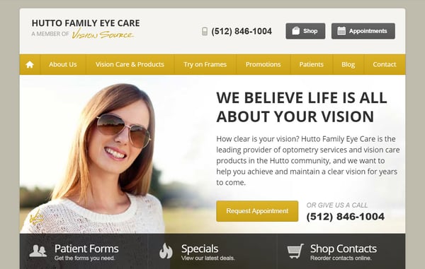
Here's a great example from Hutto Family Eye Care in Hutto, TX. They've created a special tab in their navigation bar called Try on Frames. Can't get much more direct than that, can it?!
In this example, Hutto Family Eye Care has placed a link in the middle of the bar which forwards directly from the home page to their stand-alone My Frame Gallery.
2. Post a Button
Posting a button on your website has just two requirements:
- A prominent place to post it
- A clean, clear button
Sounds easy right?
You might think of the area where a button resides as a "featured" section on the home page. It's not part of the standard items on the navigation bar, but it's something you want to draw visitors attention to.
Just remember that the button should be visually pleasing, explicit about it's function and placed prominently.
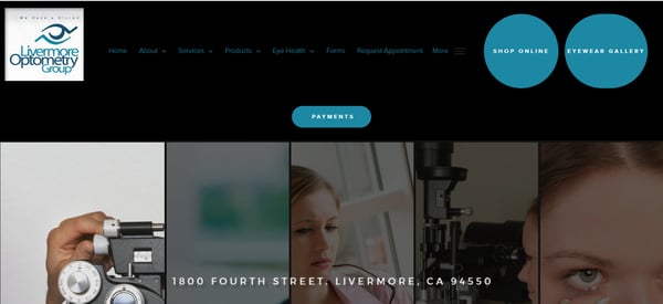
Here's a great example provided by Livermore Optometry Group. They've organized their site so that you can find anything easily in the navigation bar, but they've also prioritized their "Shop Online" (for contacts) and "Eyewear Gallery" buttons in a featured area at the top since they know those are things that will be attractive to patients.
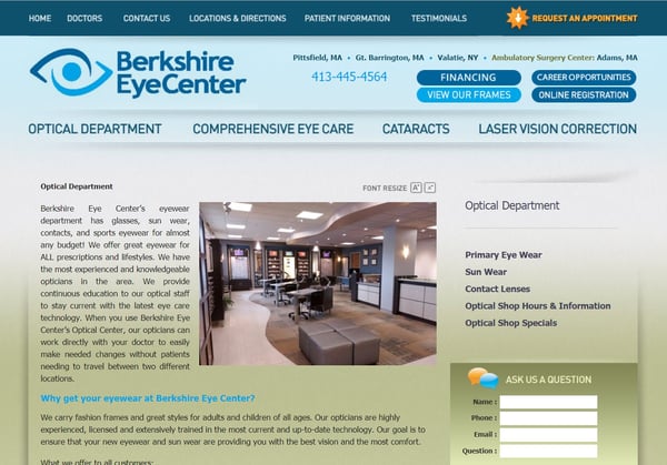
Berkshire Eye Center has created a similar area where they have clustered a group of buttons that acts almost like a secondary navigation, but with the button "VIEW OUR FRAMES" highlighted to stand out. I particularly like how both VIEW OUR FRAMES and REQUEST AN APPOINTMENT pop out from this page, since after someone views frames the next step is for them to come in for an appointment.
Progressive Eye Center, based in North Little Rock, AR, has incorporated a pair of prominent buttons into its rotating header images, one for Schedule Online and another for its Frame Gallery (again two things that go together!).
They've also created a set of three features below the header image, of which Online Frame Gallery is one. As part of that feature, they've also included two brief sentences to entice patients to explore further. The result is a nice uncluttered feature that draws visitors in.
3. Organize and Prioritize
A really good website pays special attention to organization, prioritizing the most important things higher up and allowing for more detail as the user scrolls down.
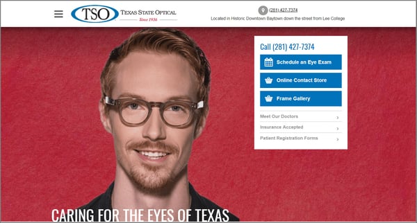
Texas State Optical Baytown is a great example of a site that does that very effectively. They've prioritized their most important items (Scheduling An Exam, their Online Contact Store, and of course their Frame Gallery) as three buttons that serve as the main navigation, with additional important topics as slightly smaller options below. As a result, finding the Frame Gallery on this site is very easy.
And even though the site appears simple at first, TSO Baytown still manages to deliver a lot of information without clicking away from home.
Website visitors today are accustomed to scrolling down for more information, and this website takes advantage of scrolling to deliver a welcome message, testimonials, location information, and links to condition articles, in a simple, well organized way, and all on the same page.
See Livermore Optometry Group (from above) as another example of a website that uses scrolling to prioritize and deliver a lot of information on one page without feeling cluttered.
4. Embed It
Lastly, you can eliminate a click away from your website entirely by embedding a Gallery directly onto the page. This solution provides the added benefit of a more seamless integration that looks native to your website.
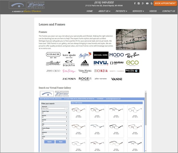
West Michigan Eyecare Associates in Grand Rapids, MI is an example of a practice that has incorporated its Frame Gallery into a pre-existing Lenses and Frames page. They didn't need to change any navigation or website architecture at all!
To embed an iframe of My Frame Gallery into your website, you simply need to insert the code for the iframe version of your Frame Gallery into your page's existing code. For more information about embedded iframes and how to get your iframe code, please read this blog post.
Making sure website visitors can easily find your Gallery will go a long way to ensuring its success.
Of course, every practice is different, and every practice website is unique. The right way to implement a Frame Gallery on your site really depends on you and your business's priorities. You may end up using one of these ideas, or you may decide to choose more than one!
Don't have a Gallery, but ready to take the next step? Here are ways to get started:
- Request information
- Request a demo
- Order now (existing Frames Data subscribers should call in to add My Frame Gallery to your existing account)
- Call us (for single location practices) at 1-800-821-6069 ext 3.
- Call us (multiple location practices) at 1-800-821-6069 ext 4.





Leave a comment